
Color Palette and Font pairing play a very important role in a company’s branding and overall placement. It does the following things for you:
- A color palette helps you set the brand’s identity
- It increases the brand’s recall value
- It makes your brand look professional
- The color palette has a psychological impact on the audience.
- Your brand color represents how the audience chooses to perceive your brand.
According to a study, Colors actually increase brand recognition up to 80 percent and are the biggest reason why consumers choose to buy!
NOW, LET’S START WITH A FEW QUESTIONS:
The questions below are just a small sampling of what kind of questions I ask my branding clients, but this should help you get a start on how to find your brand colors.
1. Off the top of your head, what is your ideal color palette (4-6 colors)?
This is just for you to reference as we move forward, I want to see if what you have in your head currently will start to align as we go through the post.
2. What 3 adjectives describe your brand?
Ex: sophisticated, ethereal, modern, minimal, warm, relaxed, whimsical, calm, earthy, elegant, etc.. (feel free to google more too).
3. What 3 Values describe your brand?
Ex: stability, mindfulness, dependability, comfort, affection, ambition, balance, grace, etc
4. If your brand were a Season, what would it be?
See below and it can definitely be a mix of a couple of seasons too!
5. What does your ideal client/customer look like?
Describe who they are (career, location, clothing, hobbies, books they read, Instagrams they follow, style of their home, etc).
.. What do you want your client/visitor/customer to feel when they see your brand and website?
This is your ‘brand essence’ and what kind of emotion you want your brand to provide people.
COLOUR THEORY
Now that you’ve answered a few questions, let’s dive into colour theory. As we know, colour can play a huge part in emotions and buying. You’ll notice a tonne of fast-food restaurants use red and yellow, a lot of natural products use brown and green, and so on.
So, as you read through the colours below (with their positive qualities) I recommend that you start to look back on those 8 questions I asked previously and see if the colours you originally chose with your colour palette start to align with the meaning behind the colour. P.S. they don’t all have to match exactly, but they should start to align with your adjectives, essence, and values.
DO THE ORIGINAL 4-6 COLOURS YOU WROTE MAKE SENSE?
From above, are the qualities within each colour beginning to blend with the questions you wrote previously? Overall, we want to make sure that the palette you choose starts to represent your adjectives, values, your season, and your brand essence (on how people feel when seeing your brand).
For example: If my colour palette is navy blue, muted pale blue, light grey, charcoal, and white, but my season is Summer and my adjectives are ‘Cheerful, Bold, Creative’, it wouldn’t quite make sense with the colour palette.
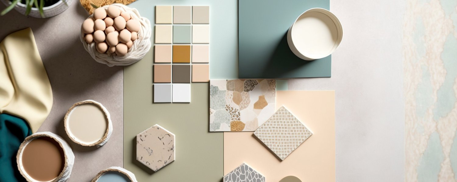
CREATE YOUR BRAND COLOUR PALETTE
Now, a super important part when finalising and narrowing down your colour palette is understanding your colour palette FORMULA. This is basically the formula I use when building out a client’s brand and how to properly use it throughout their brand pieces, website, and so on.
1-2 MAIN COLOURS | 1-3 NEUTRAL COLOURS | 1-2 ACCENT COLOURS
THE MAIN COLOURS: These are simply the main colours that represent your brand. It should be your go-to when choosing a colour for your site details, print materials, etc. For me, I have that dusty grey/lavender and then a charcoal grey. This is used for backgrounds on my site, for stationery pieces, the colour of my nails or shirt in my photos, etc.
THE NEUTRAL COLOURS: These are the colours that help pull it all together, this can be the colour used for text, maybe it’s a soft creme to add warmth to the brand, a pale grey, etc. Typically used for patterns/textures with subtle elements, maybe it’s the type of paper used for printing, maybe it’s the type of filter used on images, etc.
THE ACCENT COLOURS: These are the colours that will complement your main colours. For me, I have a dirty saffron colour and a lighter pale lavender shade that I used very sparingly, but can be used for buttons (to accent), maybe it’s a pop of colour in my brand photos, maybe it’s a heading text, etc. They shouldn’t be confused with the main colours but compliment them.
Now, are you still struggling with deciding what your colour palette could be before you launch your brand? Don’t worry, I got you covered! Get in touch with me where I will be sharing the Brand workbook with you, which will help you come up with the write Brand Colour Palette.
TO RECAP
Were you able to align your adjectives, essence, ideal client profile, values, etc with your ‘brand season’, your colour palette, and colour theory? Were you able to narrow down how each colour will play a part in your brand (main/neutral/accent)? This should be a good start on how to create your brand colour palette and hope I’ve helped you just a bit and feel free to check out the other blog posts about brand building in our blogs section